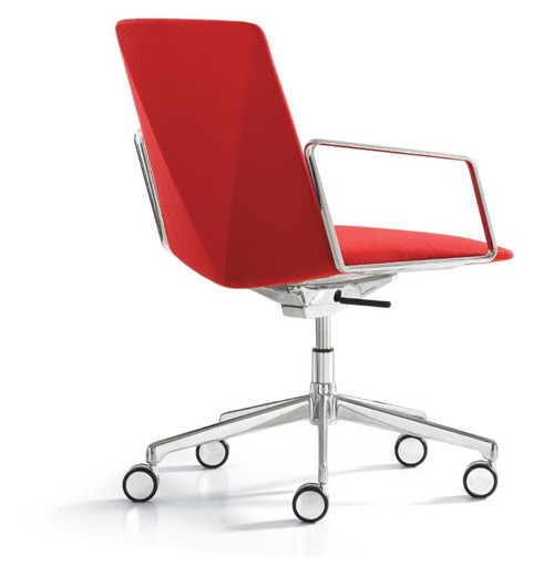
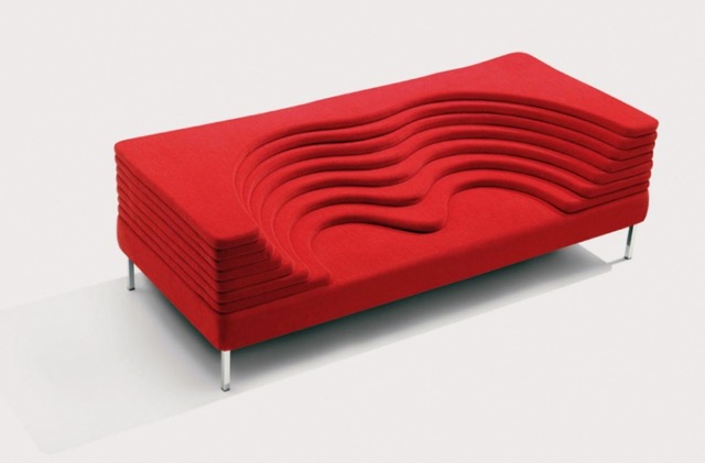
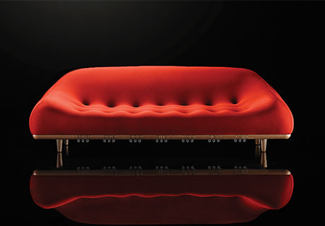
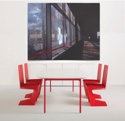
Seeing Red
June is the time of year when all corporate manufacturers release their new products. What we are seeing this year is Red! Bold, vibrant red! Red for seating. Red contrasting dramatically with white for tables and modern chairs combined. Lounge chairs and modern conference chairs are sporting the very brightest of cadmium reds married with chrome and metal. White and Red combinations are also making a powerful impact with table and chair sets, lounge seating and modern conference chairs. A very striking and traditional color way is red, white and black as seen in indigenous art, world wide. Red and white together create a powerful and exciting dynamic that brings any space or room immediately to life. Shades of red and orange work together to add warmth to cool spaces.
Modern Red Furniture


If you are not familiar with design color aesthetics–cool tones in a room are at their best when they are balanced with warm complementary colors. A room in which all colors are cool in tone appears monotonous and uninspired. Color is vital in creating the appropriate creative ambience in modern work spaces. The lack of color in many modern corporate offices indicates a lack of understanding of the psychological impact inherent in color. If you are not confident in selecting colors for your office seek a color consultation before you begin your renovations. We strongly advocate the judicious use pf color to transform dull office environments. Bring as much enthusiasm to the color plan of your work space as you would to the transformation of your own home. You will be spending a lot of time in this environment. Make it a beautiful, inspiring and enjoyable place to work.

The only sign of life in this office is the red Exit sign. If I were in this office I would take it’s advice.
Vibrant color doesn’t have to be in every room but there should be variety and effective contrasts within the range of colors throughout your offices. Your mind should be pleasantly stimulated by the visual dynamics of your space as you move around your building. Things should be complementary but not everything needs to match. It can work against the ambience of your space. But there are no rules set in stone. Unfortunately, we’ve seen too many atonal and mid-toned offices that are planned out carefully but have no darks contrasting with the lights. They are as dead as concrete in a depressed neighborhood.
I just saw a photo of a new install where there were no light colors to contrast with the dark and absolutely nothing to balance out all of the greys. Any color can work with vibrant reds and variations of red. And if you are not ready to commit to red on furniture–try adding red in the art work on the walls. Use red area rugs or accesorize with colorful vases, desk organizers,waste cans, lamps,etc. We encourage exploration in the use of vivid color for the work place. Europe has led the way in fashion with clothes and furniture for some time. In our experience the US market is always a few years behind the latest European trends. Take the plunge and be ahead of the curve. An unprecedented range of new and very vivid colors are being offered this year. Take advantage of the latest of our manufacturer’s new releases. Check out these mid-june preview scoops of the new reds in art furniture news.